Mobile-First Indexing is finally here!
In November 2016, Google announced plans to move toward Mobile-first indexing. In this announcement, Google outlined the reasoning for this change and why it’s important.
Mobile device use is up considerably. Yet, Google is still indexing the desktop version and presenting the mobile version in search results.
Depending on how the site is set up, this could result in a mismatch between search results and content for those that don’t have mobile-optimized websites.
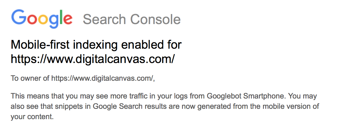
After a year and a half of experimenting Google has started rolling out mobile-first indexing. Website owners are getting notices from Google letting them know their site is now going to be mobile-first indexed.
We’re getting notices from Google, like this one…
What is Mobile-First Indexing?
Let’s see how Google explains it:
“This means that you may see more traffic in your logs from Googlebot Smartphone. You may also see that snippets in Google Search results are now generated from the mobile version of your content.”
Mobile-first indexing means Google will index the mobile version of your website first and base the search engine ranking and snippets on the content and structure of the mobile version.
To clarify, mobile-first indexing does not mean mobile-only indexing.
If you have a desktop only website and haven’t made the move to mobile it’s not the end of the world. If Google isn’t able to locate a mobile version it will still index your desktop version. But, search engine ranking and structured snippets may suffer compared to mobile-friendly and mobile-optimized sites.
Keep reading, we look to see how it affects your site and SEO.
What does mobile-first indexing mean for SEO?
Make sure the mobile version your website is SEO optimized for mobile indexing. All the important things you should be doing on your desktop website need to be implemented on the mobile version. If you have just one version (mobile responsive), you still want to check the SEO for mobile devices.
- Content: make sure the mobile version contains all the important content you want visitors (and Google) to see, including images, text, and videos. Make sure all the content is crawlable and visible on mobile devices. Yes, it’s time to remove flash and make sure the images sizes and formats are all visible, don’t run off the page or cause any left/right scrolling.
- Structured Data: include structured data in your mobile website version. Structured data is little mark-ups to HTML that act as indicators to Google and give context to the content on your website. For example, if you have an event calendar or restaurant menu, you’ll want to “tag” that correctly so Google can easily and quickly crawl that data and know what it is so it can be indexed and used correctly.
- Meta Tags: Meta Tags HTML elements, like titles and descriptions displayed in search results. You need them, but for mobile, you’ll want to make sure they are optimized with content and content length to fit mobile devices correctly. Make sure the important word’s not at the end of the meta tag and available and visible on mobile devices.
- Search Console verification: Make sure to verify the mobile version of your website in the Google Search Console. You may have the desktop version there already, but if you have a separate mobile version, make sure to get that added too if it’s a different URL.
- Sitemaps and feeds: I’ll need to make sure the mobile version of your site has a sitemap if it’s different than desktop.
- Hreflang Tags: Make sure to add Hreflang tags to the pages. This is for Google internationalization and lets Google know which language is your website’s intended audience.
How does mobile-first indexing work?
Mobile-first indexing means Google will first index the mobile version of your website, if available.
If Google isn’t able to locate a mobile-friendly website, your site will still be indexed, but search engine ranking may be lower than a website optimized for mobile users. Google uses all the same criteria for indexing and ranking search engine results, but now the difference is mobile SEO comes first.
Will mobile-first indexing affect website search ranking?
Maybe. This is very dependant on how you have your mobile website setup. Let’s take a look at the type of website you have and how what you can do to prepare.
Desktop only
Desktop only websites are not optimized for mobile and are primarily targeted at desktop computer screen sizes. Don’t fret. This doesn’t mean that your website will not be indexed, it just means that Google will use the desktop version of your website. Keep in mind, your competitors may have mobile-friendly versions and that alone may be a cause for a drop in rankings. I’d highly recommend making sure you have a mobile-optimized website to take advantage of mobile-first indexing. Don’t run out throw together a quick mobile website just to have one, that will not help. A well-optimized desktop website with good content is better than a poorly optimized mobile website with less content. So, plan this through and make sure the mobile website is ready and optimized correctly before launch and launch it when it’s ready.
Responsive web design
Responsive website design (not the same a mobile-friendly) is a website built on the same code and content as the desktop version. Typically you won’t need to do anything different to prepare for mobile-first. (Although I’ve never seen a website that couldn’t use some SEO help.) If your website is Responsive make sure that all the content that’s important and available on the desktop version is also available on the mobile version. Oh, yes, and make sure it’s working correctly and nothing’s broken on mobile. Google recommends responsive website design, so this is the way to go.
AMP
AMP websites are completely mobile optimized, so you don’t need to do anything with those. Good Job! If you’re looking into AMP (Accelerated Mobile Pages), you can find out more information here.
Separate Websites
If you have separate websites for mobile and desktop, this is where it gets more confusing and complicated. You may not need to do anything, but it will take some work. Make sure all the content on the mobile website is there.
Years ago, businesses would create a separate, scaled down version mobile website. You could check that “I have a mobile website” box. That’s ok, but make sure the mobile website is now ready for google indexing. Check the SEO list I have above for Mobile-first indexing. Doing this for two separate sites could result in double work.
It’s recommended to have a Responsive website or even just a desktop version if your mobile version is “stripped-down” and not ready.
Yes, it may be better to turn off your mobile website if you have stripped-down, simplified, mobile version with less content, and just go with your desktop website.
How to tell if my site is ready for mobile-first indexing?
Not sure where your website is or if it’s ready for Mobile-first indexing? Google has given us a couple of tools to help us.
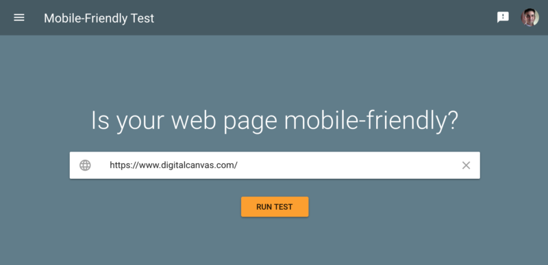
First, you’ll want to use the Google Mobile-Friendly Test. In a couple of minutes, Google will analyze your website and let you know if it’s mobile-friendly. This is a useful report, but only checks only one URL at a time and not the entire website. So, you’d have to check every page individually.
The recommended way is to use Google Search Console. The Search Console will crawl the entire website and alert you of any issues discovered, among other functionality and features. Use it.
The Google Search Console, recently re-released, previously known as Google Webmaster Tools.
Conclusion
Don’t panic.
Mobile-first indexing doesn’t mean your website will drop out of Google if you don’t have a mobile website.
Just make sure you’re serving the best content and people can read it. If your website works, it coded correctly and has valuable content Google will know and rank you accordingly.
If you are looking to take advantage of the Mobile-first indexing and don’t know how to do this yourself, hire a professional.
Digital Canvas has been building and redesigns SEO friend mobile websites.