
You heard a mobile website will increase business.
You have a mobile-friendly site, but you don’t have any more sales or leads.
What happened?
Results are the only thing that matters. If conversions haven’t improved even after your website is “mobile friendly”, there is a reason.
Let’s talk about how to fix that.
Results are all that matters
It doesn’t matter what technology or how cool the website looks on mobile if you are not getting results. When you’re running a business all that matters is results. If you’re running an e-commerce store, it’s about sales. For a blog, it may be about traffic and newsletter sign-ups. Your business website focus may be on collecting leads.
A conversion is a visitor that makes a purchase, signs up for a newsletter, completes a lead form or performs any specific action on your site that you would consider a successful visit for your business.
So, even though you made your website mobile friendly, your conversions didn’t increase. You’re not getting more leads, even though your developer told you a mobile website would do that.
Why? What went wrong?
You may be thinking mobile doesn’t matter.
Mobile Matters
It is important to have a mobile website. According to Statista, about 50% of website visitors are using a mobile device. This is a huge percentage. Think if you lost 50% of your website visitors overnight. What would that do to your business? your sales?
On a smaller scale, if 50% of visitors converted at a lower rate. It would still result in fewer conversions.
So, we know results matter and having a mobile website is important.
Let’s dive into how we can fix this.
Mobile-Friendly isn’t Mobile Optimized
Just because you have a mobile-friendly website and it looks good and functions on a mobile device doesn’t mean it’s optimized for mobile users.
How can you tell?
Here’s a list of steps to take to make sure it’s mobile optimized for users:
Track Mobile Conversions
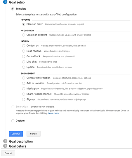 The first step is to make sure you have conversion tracking installed. You need to measure how many people are visiting your website and how many are converting. This should be broken down for both desktop and mobile.
The simplest (and free) way to do this is by installing Google Analytics. Then set up goal tracking and conversion tracking. This will tell you what percent of visitors are converting on desktop and mobile.
If your mobile conversion rate is lower than the desktop conversion rate, there is room for mobile optimization.
Mobile Performance
Believe it or not, the average load time for a mobile page is 15 seconds. This is way too slow. On mobile devices seconds count. The page should load within 3 seconds or you’re losing visitors and conversions. So, first, make sure that the page is loading fast. Faster loading pages improve user experience and search engine results rankings.
You can test your website speed with this link:
Test your website speed now!
Review the User Experience
Visit the site and perform all the functions and features of the website as a customer on an actual mobile device. Pretend you are the customer. Don’t just use a smaller browser window and call it a day. Use an actual, physical mobile device. Make sure it not only works, but it’s a good experience and there are no major blocks to using it as a mobile site. If something isn’t working right, or the site is hard to use on a mobile, get that fixed.
Reduce the Input Required
When visitors complete forms, checkout or sign-up, make sure you are requesting the minimum amount of input required to get the job done. Remember mobile users have to key each letter on a phone, they don’t want to fill out long, unnecessary forms. So, reduce the number of fields to only those absolutely required.
Less information is better than losing the visitor completely.
If it’s an e-commerce store, this is tricky, because you need the full address, email address, phone number, credit card number etc, etc. With e-commerce, there are a lot of fields. Give mobile customers simpler checkout options like Google Wallet, Apple Pay or Paypal. Reduce the clicks to single-click check out, if possible.
Continuous Test Everything
 Continuously A/B and Multi-Variant testing lets you see what works best over time. Obviously, you need to measure and record the tests and the results. As you do so continuously improve the forms and stop doing what’s not working. You will make some mistakes along the way, this is normal. It’s important to record those mistakes and learn from them, so you can continuously improve.
People have a lot more options and are using mobile devices more than ever. We need to make sure we are optimizing the User Experience for mobile users and not just making our websites mobile-friendly and calling it a day. By improving the overall Mobile User Experience you see increased mobile conversion rates and happier website visitors.
More Leads & Sales
Let's Talk!